Cart (0)
Close
Johnson & Johnson Logo History, Changes, and Current Updates
Established 1886 in the United States, Johnson & Johnson is a significant player in pharmaceuticals and personal care products. Established by three Johnson brothers, it has grown into a worldwide distributor and one of the most profitable companies globally.
So here, “Logo Designs Company,” the top logo design company, wants to tell you something about the Johnson & Johnson logo, its history, its changes, and what is currently happening.
What is the symbol of Johnson & Johnson?
The symbol representing Johnson & Johnson is a distinctive logotype. It features elegant cursive lettering with a recognisable ampersand connecting the two parts of the company’s name. The logo’s unique letter contours, smooth lines, and a vibrant shade of red combine to effectively convey the brand’s identity.
Meaning and history
Johnson & Johnson is a brand that has steadfastly retained its original logo since its inception. Initially seen on a check signed by James Wood Johnson in 1886, the founder’s signature made its way onto product cans by 1887.
1886-1890

In 1886, during the company’s inaugural year, co-founder James Wood Johnson penned the first official Johnson & Johnson check, payable to a local railroad freight master, complete with the company name in a similar style.
The birth of a logo occurred in 1887. The company’s earliest products, utilised in sterile surgical procedures, showcased a logo resembling Johnson’s signature, featuring large loops on specific letters and connecting the ampersand to the second “Johnson.”
By the 1890s, the company’s logo started gracing horse-drawn waggons for delivering products like first aid kits and medicated plasters to local retail customers.
1921-1988
Fast forward to 1921, and James Johnson’s handwriting took on a different role. It was incorporated into the package design for products geared towards babies, particularly a new cream. This signature-inspired logo remains a staple on Johnson’s® Baby products today.
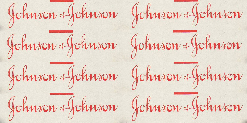
The mid-20th century saw products sporting various logo styles, some resembling the current Johnson & Johnson logo (as seen on the BAND-AID® Brand adhesive bandage tin). In contrast, others leaned more towards resembling actual handwriting. However, in the 1950s, the company standardised its packaging to adopt the logo we recognise today.
In 1988, as China opened its doors to Western businesses, the Johnson & Johnson logo appeared in Chinese, notably on consumer products like BAND-AID® Brand adhesive bandages.
2011-2016
Fast-forwarding to 2011, the company developed an innovative solution for surplus lipstick containers produced for the Neutrogena business as a nod to sustainability. They created “lipstick walls” featuring the company logo, displayed in seven company locations across the U.S., Brazil, and China.
In 2016, Johnson & Johnson introduced an animated logo on its revamped corporate website, adding a touch of whimsy to the iconic signature.
2023 – Today
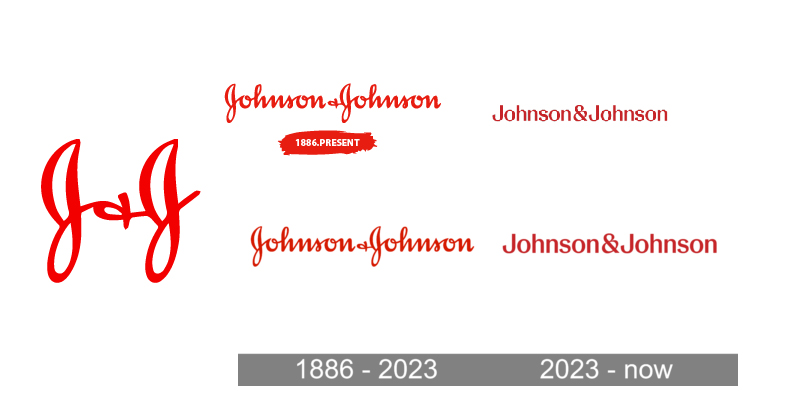
In the beginning of 2023, Johnson & Johnson’s visual identity has a custom typeface. It is inspired by the original signature of the company’s founder, James Wood Johnson. While slightly modified and strengthened, it retains the feeling of handwriting and a unique character.
The logo typeface be like commercial fonts such as Adelica Brush Regular, Gelato Fresco Extra Bold, and Ollie. Though, it has been revised with narrower lines and contours.
The reduced shapes of the letters give a strict and professional appearance. At the same time, the company’s official colour palette, with the mixture of scarlet-red and white, gives a friendly and welcoming overall logo look.
The brand’s logo now and then appear in a black-and-white colour scheme or blue-on-white. In these variations, the iconic inscription is more severe and stable—give emphasis to the group’s professional qualities, expertise, and reliability.
Now, here’s the News: After over 130 years, Johnson & Johnson is bidding farewell to its signature script logo
Johnson & Johnson, a prominent healthcare giant with a history spanning over 130 years, is again on a logo change— emphasis on pharmaceuticals and medical devices.
The iconic script logo, (signature of co-founder James Wood Johnson,) in use since 1887, is now comes to its end in favour of a modern design. This shift is intended to reflect their commitment to the healthcare sector. The new logo, featuring a distinct shade of red, mirrors J&J’s transition into a “pure play healthcare company,” as expressed by executive vice president Vanessa Broadhurst.
For now, the original script logo will continue to grace consumer products like Kenvue’s baby shampoo, a recently spun-off subsidiary of J&J. Johnson & Johnson itself is narrowing its focus to pharmaceuticals and medical devices.
Once considered one of the world’s longest-used corporate emblems, the former script logo began to show its age in an era characterised by texting and emojis. With the decline of cursive writing instruction in schools, people may have recognised the signature but needed to be reading it.
According to marketing consultant Laura Ries, the new logo is designed for easier comprehension, even capturing more attention due to its simplicity. Ries, who was not involved in the logo change, also observed that people likely associated the script logo more with Kenvue products such as Band-Aids, Listerine, and Tylenol, commonly found on drugstore shelves.
A spokesperson for Kenvue confirmed that the J&J branding on products like Band-Aids would gradually be phased out. The script logo was also featured on containers of the company’s now-discontinued talcum-based baby powder, which faced lawsuits alleging a link to cancer, a claim J&J vehemently denied.
The consumer part helped J&J become the world’s biggest healthcare products maker, selling over $90 billion every year. However, their pharmaceutical and medical device divisions had outgrown their sise by the time the spinoff was announced in late 2021.
Furthermore, Johnson & Johnson, headquartered in New Brunswick, New Jersey, is set to rebrand its Janssen pharmaceutical arm as Johnson & Johnson Innovative Medicine, while its medical device and technology division will adopt the name MedTech.
Conclusion
Now, you are aware of this new boom in the company Johnson & Johnson logo. If you want to be like them and give a new look to your logo, then called “Logo Designs Company,” the top logo design company in the U.K.
Whether you want to create cheap promotional products in the U.K or want a professional animated video, they serve their client with all these offerings for branding, so visit their fascinating sites and select the service you want.


